Mobile app · carpooling & navigation · solo project
Turning carpool anxiety into certainty for 80% of
unsure parents
Prototyping
Consumer UX
Parental UX
Mobility Tech
Video


role
duration
tools
team
type
Solo UX designer + Researcher
04 weeks


Solo research & design
mobile app
01 · the domain
Nobody agreed on anything. Everyone blamed the group
chat.
School commutes are a daily ritual for millions of families, but the coordination layer is completely
broken. Pickup times change last-minute. Drivers cancel. Kids stand outside not knowing if their ride is two minutes away or stuck three streets over.

The specific problem: there is no dedicated, trust-forward tool for school carpooling that gives
parents visibility, drivers clarity, and students confidence simultaneously. WhatsApp and generic
ride apps are workarounds, not solutions.
The problem isn’t logistics. It’s that nobody trusts the logistics.
02 · the product & user
Two tabs. One complete app.
Routely isn’t just a carpool app. It’s a school commute app - built around two features that work
independently but complement each other completely.
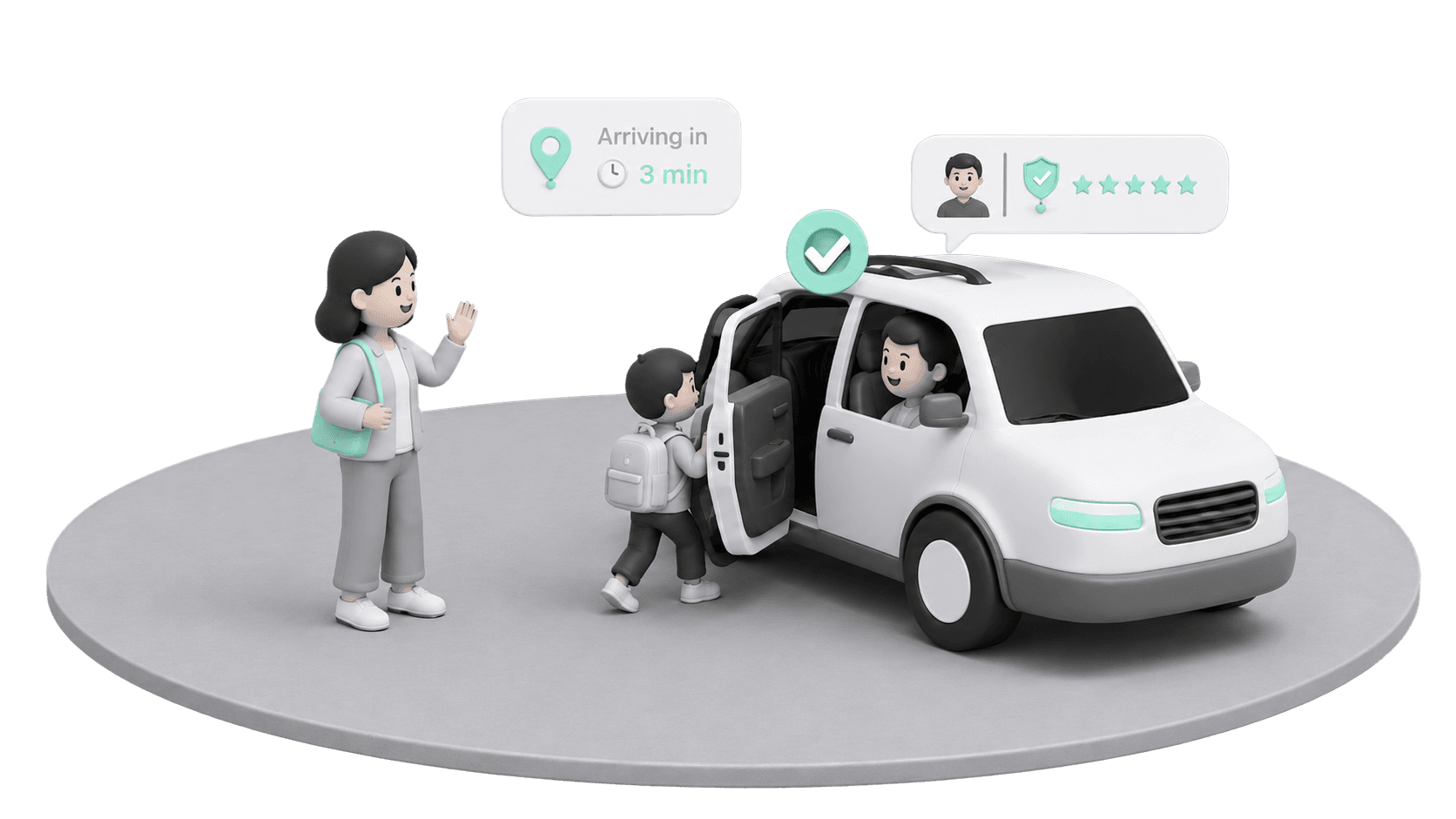
carpool tab
Drive together
Match with school parents. Book a seat. Track the
driver live. Built around trust signals, not just
schedules.
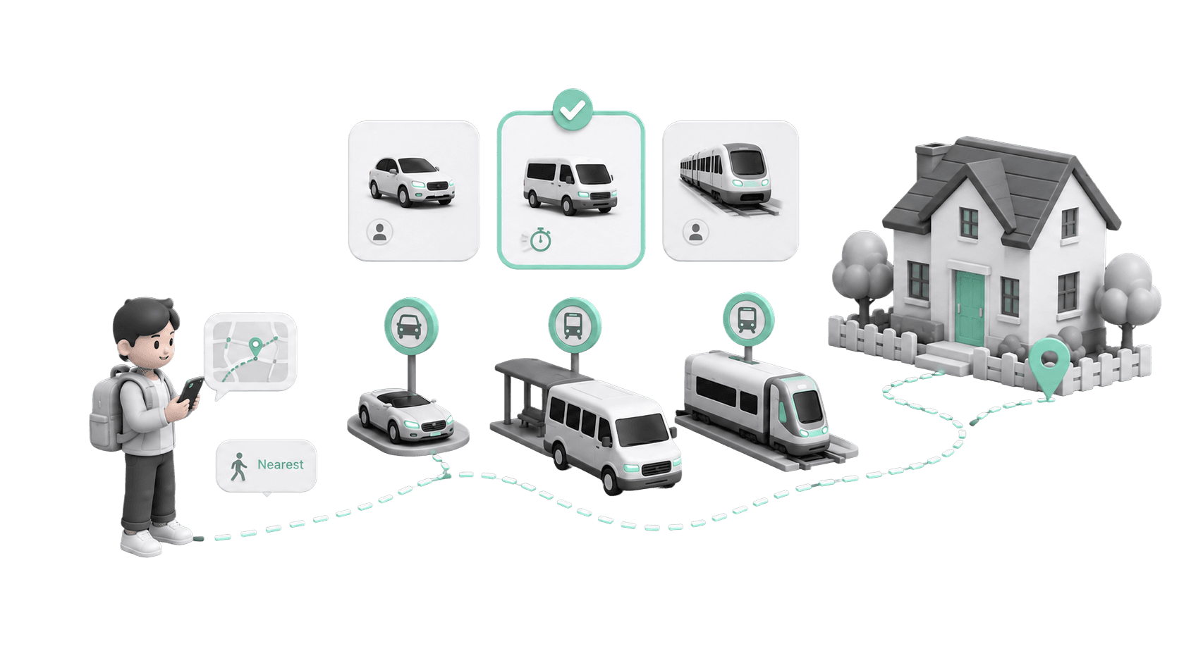
routes tab
Get Home alone
Travel independently with the best available options nearby - from cabs and public transit to other routes. Compare choices, pick what works best
04 · constraints
The playing field wasn’t exactly flat.

Limited time
No extensions. Scope had to be cut ruthlessly: payments, rewards, and group management were all shelved before a single pixel was placed.

Research bandwidth
Solo project. No research team.
Survey plus five informal interviews was the ceiling. Every insight had to work harder than usual - nothing could be throwaway.
No stakeholders to push
back
No PM. No dev for feasibility checks. The discipline to cut scope had to come from self-imposed structure. The brief became the boss.

GoKid
Community carpool scheduling
strong
Parent-invites-parent trust.
Centralised scheduling kills the
group chat. Reminders reduce
missed pickups.
gap
Tracking behind paywall. High setup
friction. Human error by design —
changes depend on every parent
updating correctly.

HopSkipDrive
Vetted caregiver drivers
strong
Rigorous vetting and background
checks. Pickup verification. Live
tracking at every stage.
gap
Service model, not community.
Scheduling ahead required. Too
expensive for daily commutes.
Waze Carpool
Route-based matching
strong
Navigation-first routing and traffic
intelligence. Route-based matching
reduces detours.
gap
Adults only — zero child-safety UX.
Ratings-only trust. Needs density
most school neighbourhoods lack.
05 · comparative analysis
Three apps walked so Routely could sprint.
GoKid, HopSkipDrive, and Waze Carpool each solving a slice of the problem. None solving all of it. The gap between them is where Routely had to operate.
GoKid has community. HopSkipDrive has trust. Waze has navigation. Routely needed all three,
without being any of them.

05 · Method
I wrote a questionnaire covering every question the project needed answered — how the commute is currently coordinated, what gets decided in the group chat, what happens when a driver cancels, and what a parent wants to know before their child gets into someone else’s car.
I printed hard copies and handed them out in person to the target group rather than posting a link, because a form in someone’s hand gets filled in and a link in a group chat does not.
user research
18
of 47 respondents used the word “trust” without being
prompted. No question asked for it. It just kept appearing.
who’s driving?
80%
Driver identity = #1 concern — above timing, cost, and route
coordination is chaotic
91%
WhatsApp groups, last-minute calls — no single source of truth
no eta visibility
62%
Standing outside, not knowing — most stressful daily moment
no backup plan
49%
When carpool falls through — zero fallback. Every other app ignores this.
★
This became the north star — design for trust first, features second.

05 · Understandings
Four findings, four answers. Each one is a layout decision, not a feature request.
01
Trust is a visual problem
A face, a school badge, a checkmark — shown before booking, not after. The driver card’s hierarchy
does the work extra vetting features couldn’t.
02
A persistent ETA strip
Map-led tracking with the arrival time pinned to the bottom sheet, so nobody has to reopen the app
or send “where are you?”.
03
No dead ends
No carpool match hands off to the Routes tab with the school already filled in. The failure state is a
handoff, not an apology.
04
One dashboard replaces the chat
My Trips holds active, upcoming and completed rides as plain rows with a status each. Nothing to
scroll back through.
09 · Ideation
Everything started in FigJam — user flows, affinity mapping, and low-fidelity frames laid out side by side so the whole product could be read at once.

09 · Solution
Four prototypes, each answering a specific finding from the survey. Every one was clickable before it was polished — the point was to test whether the flow removes doubt, not whether the screen looks finished.
01. Routes / Carpool toggle
A segmented control pinned to the top centre of Home. One tap switches the entire screen between carpooling with another parent and driving yourself.
Solves the 49% with no backup plan. Both modes are one thumb-width apart, so failure in one is never a wall — it’s a tab.
02. Carpool — pickup to request
Enter pickup and destination, see the parents driving that route, open any driver to read their profile — school verification, trip count, vehicle, seats, timing — and only then request the ride. The decision point sits after the information, never before it.
Solves the 80% whose first question is “who is actually driving?”. Requesting is a deliberate act taken with a face and a badge on screen, not a blind booking.
03. Routes — the backup that became a product
Directions to school and back, with the mode of transport left to the user — drive, walk, transit — and any route savable to My Routes for the next morning.
Solves the 62% with no ETA visibility and the same 49% with no fallback. Three of five testers said they’d use it on solo driving days, which is how a backup turned into the second half of the app.
04. Navbar walkthrough
Four destinations, no more. Home books the ride. Trips holds every upcoming and completed carpool as a row with a status. Routes keeps the saved journeys. Profile is where a parent manages their own details, children, and school.
Solves the 91% calling coordination chaotic. Trips replaces the scroll-back through a group chat — what is happening tomorrow lives in one tab, not in four hundred messages.
14 · honest gaps
What this project knows it’s missing.
Driver onboarding was never designed
The matching algorithm is a black box in the UI
Accessibility wasn’t formally tested
Real dev collaboration would have changed the designs
Let’s create better experiences together :)
Jeevan . cjeevan2709@gmail.com
13 · reflection
What I’d tell myself at week 1.
trust
Trust is a visual problem first.
18 people used the word “trust” unprompted. I assumed it needed more features — better vetting,
more reviews. Research showed they just needed to see a face, a school badge, and a checkmark.
The visual hierarchy of the driver card was doing the job features couldn’t.
routes
Routes almost wasn’t in the brief.
It started as “the fallback for when carpool fails.” Testing changed that. 3 of 5 users said they’d use
Routes independently, on solo driving days. It wasn’t a backup — it was the second product. I almost shipped without naming it properly.


09 · user testing
Unmoderated prototype sessions — 3 parents, 2 students. Figma prototype on their own devices.
Notes on where they hesitated, not just whether they succeeded.
task
P1 · parent 38F
P2 · parent 41M
P3 · student 16M
P4 · parent 44F
P5 · student 14F
T1 — Book carpool
✓ 42s
✓ 38s
✓ 30s
✓ 52s
✓ 34s
T2 — Driver details
✓ 18s
⚠ 35s
✓ 22s
✓ 20s
✓ 16s
T3 — Track live trip
✓ 25s
✓ 20s
⚠ 44s
✓ 30s
✓ 22s
T4 — Routes tab / backup nav
⚠ 60s
✓ 28s
✓ 32s
⚠ 55s
✓ 29s
usability test - task observation log · ⚠ = hesitation noted, task still completed
5/5
completed carpool booking under 60s.
Form-first layout validated.
100%
spotted driver trust signals — badge and
school label — unprompted.
Research findings → validation.
trust concern addressed
88%
coordination clarity
92%
eta anxiety reduced
76%
fallback flow completed
100%
