Video

fintech · compliance experience · UX Research & Design
Fixing the 3 trust breakdowns behind Citi’s KYC abandonment problem
B2C
Banking
Mobile KYC
Identity Verification
Banks are required to periodically verify customer information to support anti-money-laundering compliance and keep customer profiles up to date.
For Citi, that meant asking eligible customers to confirm details like where they live, what they do for work, and how they earn income through an annual in-app KYC refresh.
The challenge: customers do not experience this as a compliance requirement. They experience it as a sensitive, repetitive questionnaire from their bank.
Once a year, your bank asks who you are. Legally, it has to.

01 · the domain
“
52% of Eligible customers were not completing the annual KYC refresh, creating compliance risk for Citi and potential account-access risk for customers.
Problem Statement
🏦
How might we help customers finish a form they never wanted to start?
To understand why customers abandon the refresh & other potential pain points in their journey
User Research
Flow audit • Customer interviews • Comparative Analysis • Usability testing
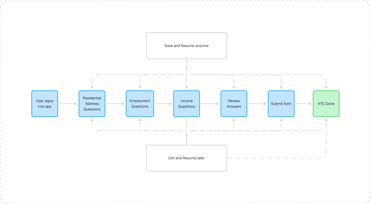
With no way to save progress. One interruption a phone call, a toddler, a meeting that could have been an email and you started over from zero. The form treated your time as free.
Notifications were being seen, but we identified massive drop-off between seeing the prompt and submitting the form, which is exactly where a design can earn its keep. Citi’s legacy flow was a strict, linear march
1 in 2 customers walked away
sign in
→
address
→
employment
→
income
→
finish


02 · the product & user
Six months of research, testing, and iteration across one of banking’s thorniest compliance flows.
before the redesign
now how we got here
after the redesign
From friction to finish: what it took to move the needle on compliance

Clearer copy, visible progress, easier navigation, and save-and-resume support made the flow easier to trust and complete.
74%
A long, rigid flow with no save option, unclear language, and little sense of progress caused users to abandon the form.
48%

03 · The result upfront
“Minimize scrolling” was never the real problem. It was three interconnected problems: trust - users didn't recognize why compliance data was necessary; transparency - say why, in plain language; persistence - no save and resume meant every interruption was an abandonment."
Auditing Citi’s legacy flow and redesigning the path forward
old flow
EXIT

new flow
Flow Audit
Before drawing anything, I mapped the legacy flow and sat down with customers. Auditing the flow took an afternoon. Understanding why people quit took the interviews. Qualitative interviews surfaced three friction themes. The form competes with real life and real life always wins.
Three customers, three ways to lose them
03
20-year long customers being asked their address feels like a hotel asking a regular for ID. Redundancy erodes trust.
“I don’t understand why I need to provide this information again for an account I’ve had for years. It feels repetitive and makes the request seem unnecessary.”
- Dianna

02
when a bank asks for your income without saying why, it doesn’t read as compliance.
“I’m not clear on why the bank needs this information. Without understanding the reason behind these questions, I feel less confident about sharing it.”
Robert-

01
without save-and-resume, every interruption is an abandonment.
“ I usually set aside time to complete it, but work, kids, or other interruptions get in the way. Being able to save my progress and return later would make it much easier.”
- Shalini

User interviews
To understand how consumer products fit “many fields on a tiny screen” and how large companies handle form-filling flows I conducted desk research. However, I found limited evidence to establish a clear starting point.
Direct banking examples were limited, so I studied adjacent long-form mobile experiences to understand how other products reduced perceived effort. Three patterns kept showing up:
How other companies cram a long form onto a small screen?
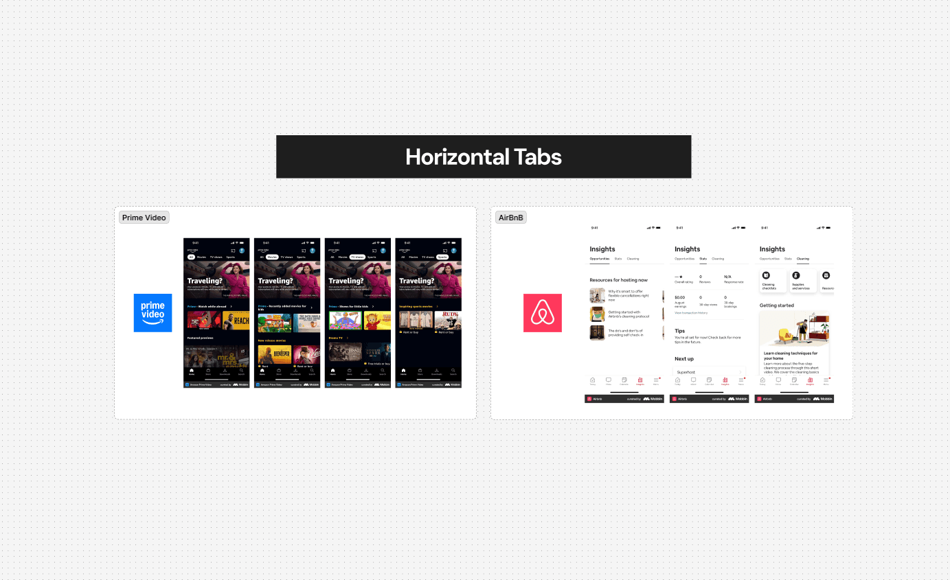
Separated each section into a left-to-right sequence. This created stronger focus and a clear sense of progress

Presented one step at a time with a single primary action, but increased the number of screens and made the overall form feel longer.
Selected

It gave users a clear view of the full form, reduced scrolling, and made it easier to move between sections without losing context.
Comparative analysis
The redesign lived within Citi’s design system. Navy primary (#1F2C6C) and gold accent (#FFC629), native component library (buttons, inputs, cards), and accessibility standards ensured the KYC flow felt cohesive with the broader Citi digital ecosystem.
Citi Design System : The Foundation
Logo

Typography
title/primary 26/32px
Headline
Nav Bar Title 16/18px
Headline
body 16/22px
Headline
subtitle primary 12/18px
Headline
subtitle TEXT 10/18px
Headline
Color
Primary
ADA Gold
#F1C62C
Primary
SGL Blue
#282C64
Light Grey
#A8A6A7
Dark Grey
#696968
Black
#353535
Spacing
8px
16px
20px
28px
Back
Back
Next
Next

Country
United States
Country

Income
Is this your current annual income? If not, please update
Total Annual Income
$340,000
This is correct

After usability testing, the biggest opportunity was not to add more features - it was to remove confusion. Users were skimming the intro, some did not understand the exit action, and others wanted more confidence before submitting their information.
Based on those findings, I tightened the copy, reduced visual weight, and added a review moment before final submission. The project tested with 6 participants and the final work contributed to submission rate growth from 48% to 74%.
What changed after testing


Added a review-and-edit step
Reduced anxiety before submission and made the final confirmation feel safer.

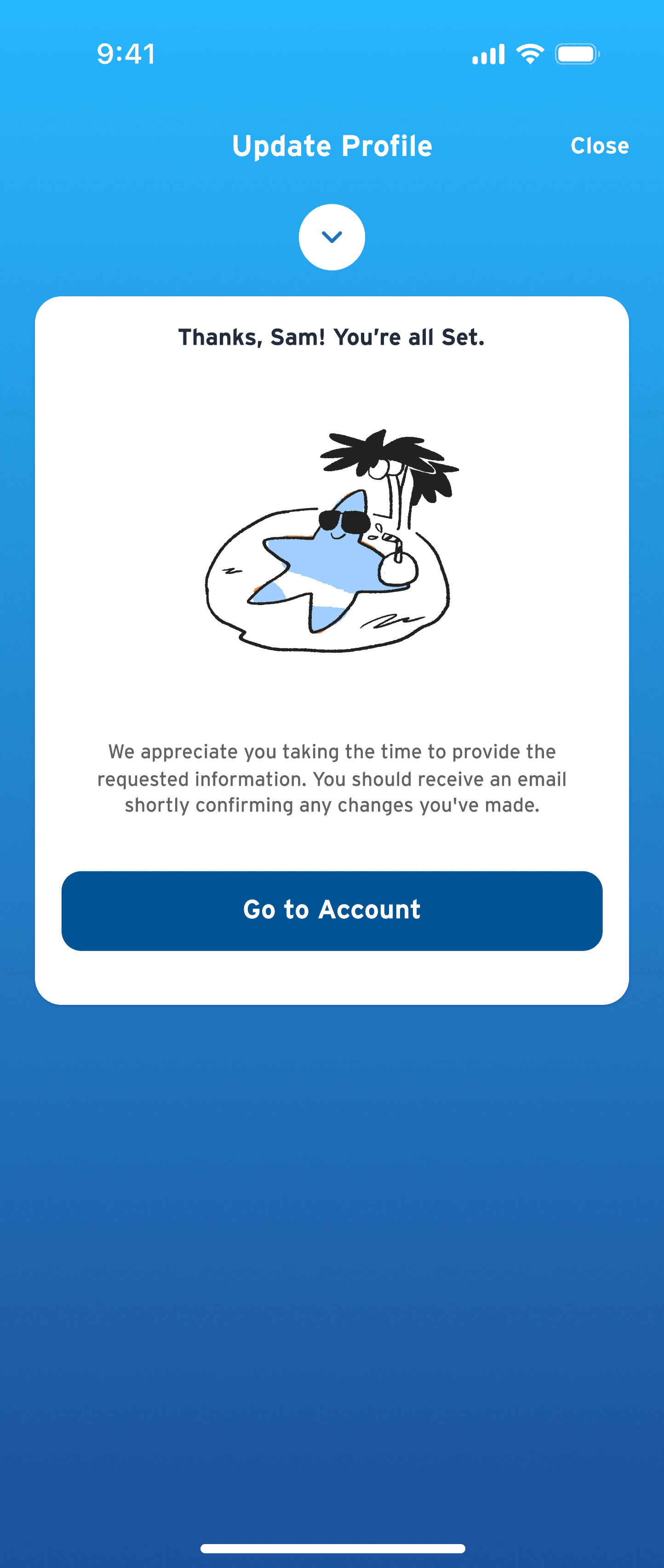
Removed the illustration and “Go to Account” button
Pushback from the developers requesting to limit the number of illustrations due to size and load time considerations.

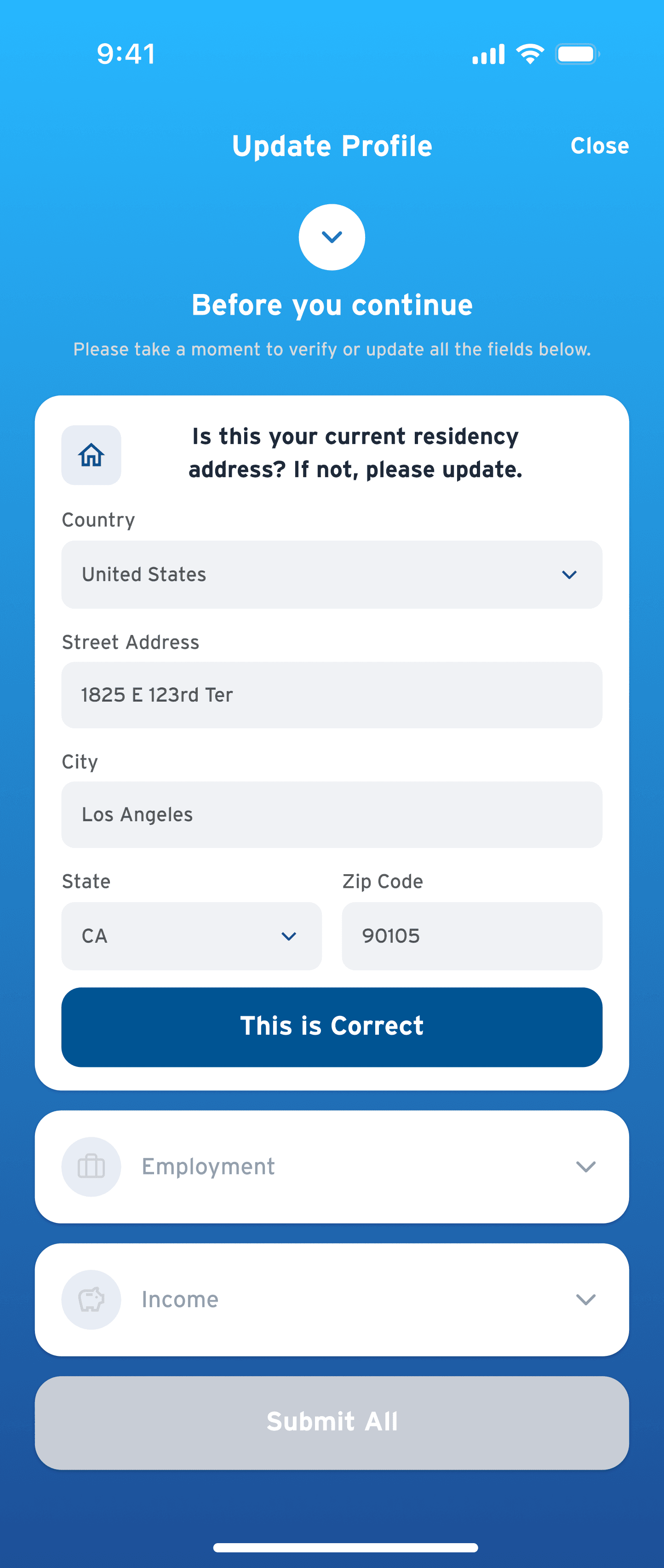
Changed from “Update Profile” to “Attention required”
Increased the chance that users understood this was important, not just a casual profile edit.
Reduced button sizes
Improved visual hierarchy and reduced the feeling that the interface was pushing too hard.
Changed “Close” to “Skip”
Helped users make a clearer decision: continue now or intentionally leave for later.


Removed dense recording-info copy and scattered bold keywords
Understood the purpose faster, especially on mobile where attention is limited.
After the comparative analysis, I started seeing a pattern: companies were not solving long forms by simply making them shorter. They were making them feel lighter by changing how information was grouped, revealed, and moved through.
So I moved into multiple design directions instead of jumping into one solution too early. The goal was to explore how each pattern would behave in a KYC context, where the experience had to feel clear, trustworthy, and serious without becoming intimidating.
Despite the fact that each pattern had clear strengths and weaknesses, the accordion won because its risks were easier to manage - and its strengths directly matched what users needed.
It gave users visibility, control, and confidence while sharing sensitive banking information. Tabs and button-based flows were visually clean, but they either reduced flexibility or hid the full scope. In a regulated banking flow, that becomes a trust risk.
Tabs and button-based flows were visually clean, but they either reduced flexibility or hid the full scope. In a regulated banking flow, that becomes a trust risk. The accordion had manageable UI risks; the others created confidence risks.
Why Accordion Won ?
Direction A won the room
Vertical accordion
A single-page structure where Address, Employment, and Income sections could expand and collapse.

Direction A
Chosen ✦
Direction B
Horizontal tabs
A section-by-section layout where users moved across Address, employment, and income like steps in a sequence.

Direction C
Button-based flow
A focused, one-screen-at-a-time experience with a clear primary action on each page.

Works
Shows the full form upfront and makes editing easy.
Breaks
Hidden errors can be missed without clear status indicators.
Works
Gives a clean step-by-step structure with visible sections.
Breaks
Harder to jump back, review, or edit on mobile.
Works
Keeps each screen focused and visually simple.
Breaks
Adds more steps and hides how much is left.
Let’s find out whether users trusted it or not ?
After choosing the accordion direction, I built a clickable KYC prototype and tested the full flow end to end. The goal was to validate whether the new structure gave users enough clarity, control, and confidence to complete a sensitive banking task without feeling lost or pressured.
I ran moderated 1:1 usability tests with 6 participants. The goal was not just to see if people could finish the flow, but to understand whether the experience felt clear enough to start, safe enough to pause, and trustworthy enough to submit.
blurred them for obvious reasons
I tested five key moments: the entry screen, accordion section behavior, skip/save logic, review step, and final submission. I asked users to walk through the flow while thinking aloud, watching closely for hesitation, confusion, and moments where the banking tone either helped or hurt trust.
Taking the accordion for a test drive

01.What do you usually open your Citi mobile app to do?
To Understand their normal banking behavior and expectations before introducing the KYC task.
Question asked
What users said
02.Where might you go if you’re busy and can’t complete the questionnaire right now?
To test whether save, skip, or resume behavior felt discoverable.
03.Where would you find more information about the questionnaire?
To check whether users understood where to look for context and explanation.
2/6
Most users said they open the app for quick tasks like checking balances, reviewing transactions, paying bills, or moving money not to complete long questionnaires.
All the users looked for a clear way to leave the flow and expected the app to save their progress automatically. Some looked for language like Skip or Save for later instead of Close.
100%
Users expected a short explanation near the start of the flow, not buried in legal copy. They wanted to know why Citi needed the information and whether it was required.
5/6

Not every improvement needed to ship at once. Since this was a regulated banking flow, I prioritized the changes that would reduce the biggest friction points first - helping users complete the form with more clarity, control, and confidence - while identifying what could be phased into later releases.
What Shipped and What waited ?
v1·What needed to ship first
Vertical accordion structure for Address, Employment, and Income
Clearer entry point and more direct task framing
Save / skip behavior that supported interruption and return
Review-and-edit step before final submission
Cleaner success flow with fewer unnecessary decisions
v2·What could be improved next
Pre-fill more known customer information
Only ask customers to confirm fields that have changed
Personalize helper copy based on account history or user profile
Build a more robust cross-platform save-and-resume experience
Expand testing with a wider mix of customer segments, including frequent abandoners
The redesign helped turn a mandatory compliance task into a clearer, more trustworthy mobile experience. By improving the structure, copy, navigation, and review flow, the KYC refresh became easier for customers to understand, pause, and complete.
Impact and achievements
KYC submission rate
Funnel performance at 2022 YTD
Relative Lift
Data Capture
~Increased from 4,009 to 9,028
60% impression rate
SHOWED POSITIVE 2022 ytd PERFORMANCE
Data Capture KPI
Submissions
+ 6,691
~54%
48% to 74%
This was not a blank-slate redesign. KYC is a regulated banking flow, which meant the experience had to improve completion without removing the sensitive questions Citi was required to ask.
The challenge was to create more clarity and control inside a flow that still had strict business, compliance, and engineering boundaries.
The core constraint was not just “fit more fields on mobile.” It was: make a mandatory, sensitive, low-motivation task feel clear enough to start, safe enough to pause, and trustworthy enough to complete — within the limits of compliance, time, and existing systems.
Constraints

Regulatory content could not simply be removed
The flow had to stay compliant
Concept selection involved stakeholder judgment


(see next)
Let’s create better experiences together :)
Jeevan . cjeevan2709@gmail.com

role
duration
tools
team
type
user experience Designer
06 months


2 designers
1 copywriter
b2c